GVC Group — V6 Platform
Responsive Sportsbook Redesign
One responsive platform replaced separate mobile and desktop codebases across 10 betting brands — mobile-first, white-label, built to scale.
One responsive platform replaced separate mobile and desktop codebases across 10 betting brands — mobile-first, white-label, built to scale.
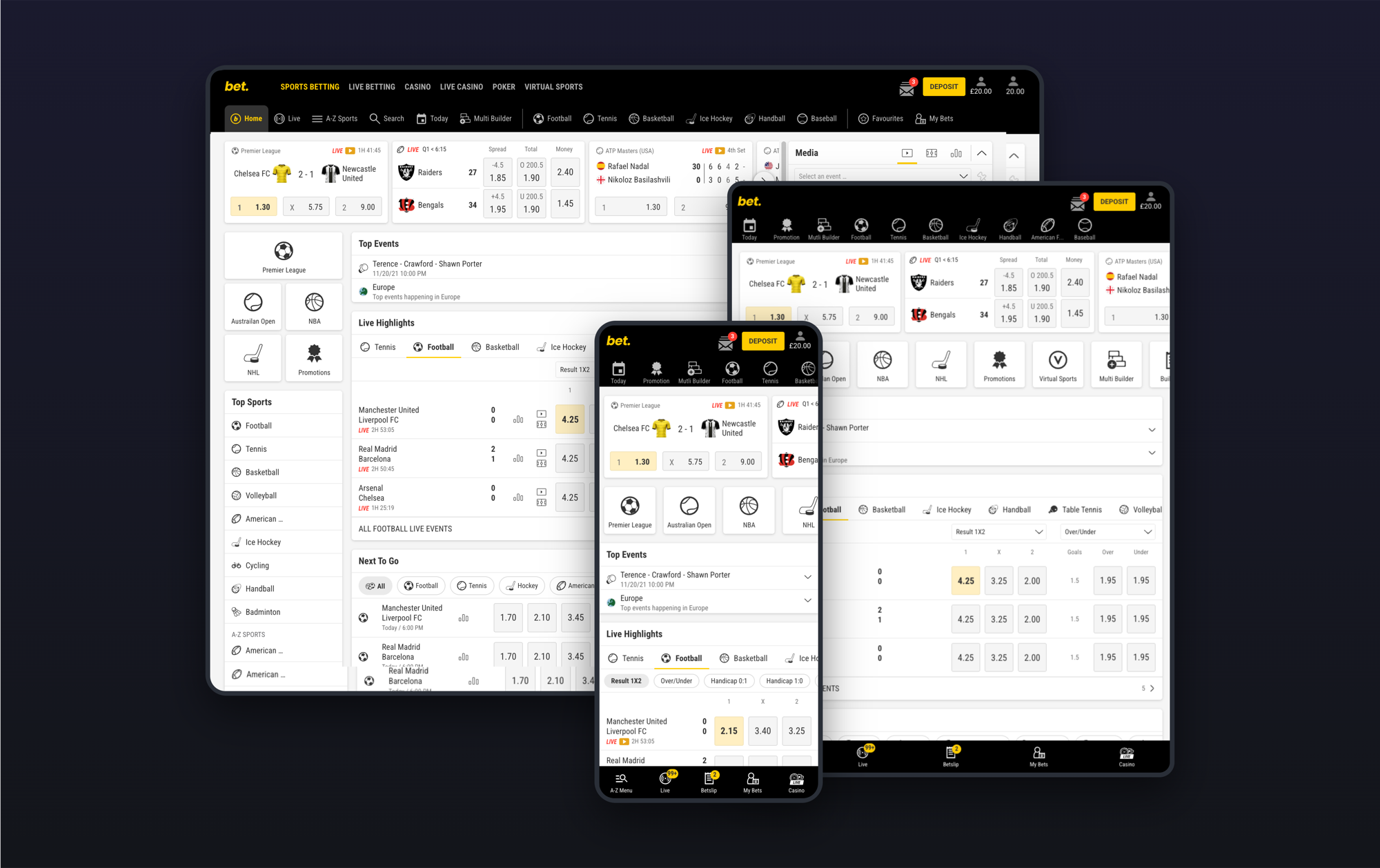
GVC ran separate codebases for mobile and desktop. Every feature built twice. Every bug fixed in parallel. Users switching between phone and laptop hit two different products. We replaced all of it with a single responsive platform serving 10 brands from one codebase.
I was one of four designers on the project. My focus areas were global navigation, the betslip, My Bets, sports market layouts and responsive behaviour across mobile, tablet and desktop. I owned these end-to-end — from early concepts through to production-ready specs and developer handoff. The wider team covered registration flows, promotions, account management and the CMS-driven content layer.
Mobile and desktop were built independently — different navigation, different features, different release cycles. A fix for bwin didn't reach Coral. Users noticed every time they switched devices.
Every feature built twice. The two versions often diverged — different UI patterns, different market structures, sometimes different feature sets entirely.
Prices change multiple times per second during live events. The UI had to update without causing layout shift or mis-taps on real-money selections.
Brand expression was hard-coded. Partners couldn't configure or customise without engineering involvement. Theming needed to live at the token level.
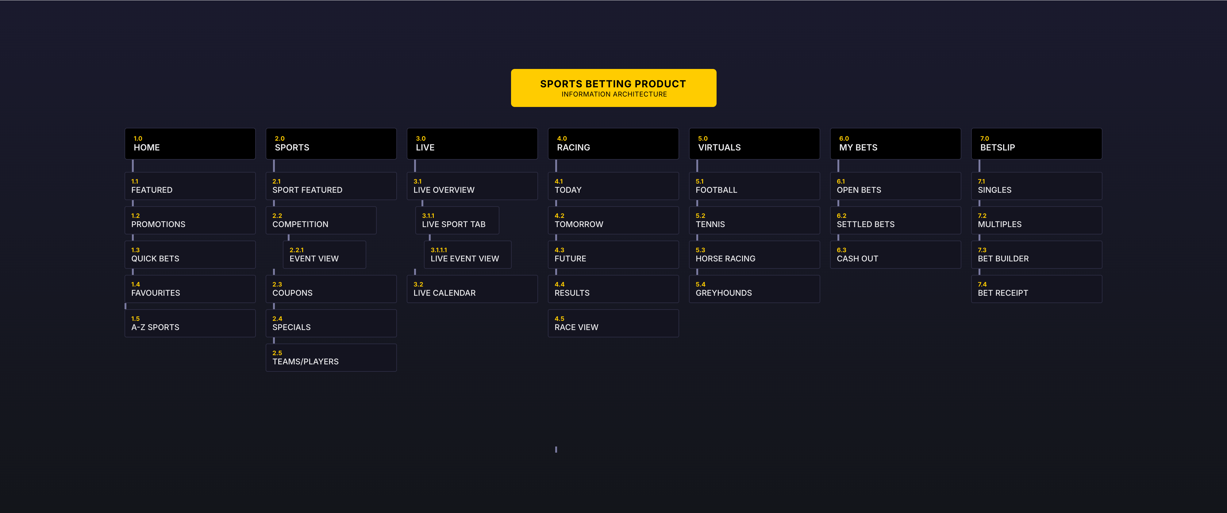
Mapped the entire navigation structure across Sports Home, Live, Racing, Virtuals, My Bets, and Betslip — defining how content hierarchies shift between mobile and desktop.
Every page designed mobile-first across 320px, 768px, 1366px, and 1920px. Content reflows, columns shift, features adapt — but the experience stays consistent.
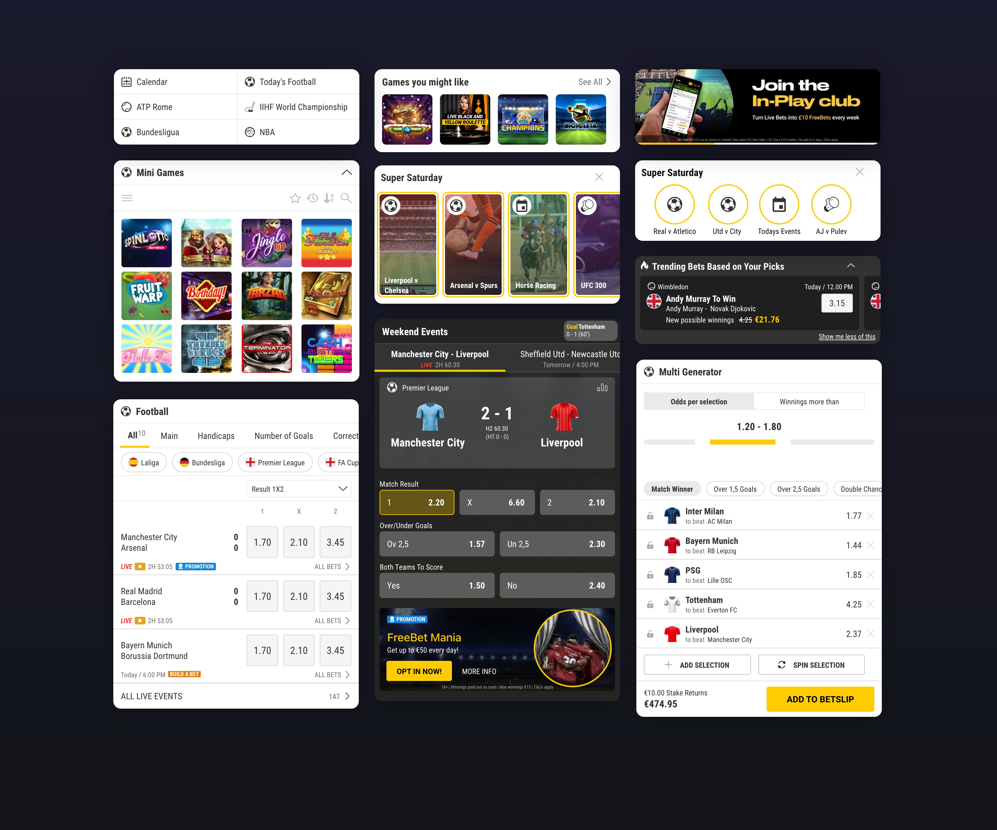
Built a reusable module library covering sports lobby, coupons, live events, betslip, and navigation. Each module defined across all breakpoints with responsive reflow behaviour.
85%+ of traffic is mobile. Every screen designed for one-handed use — from live event browsing to bet placement to cash out.

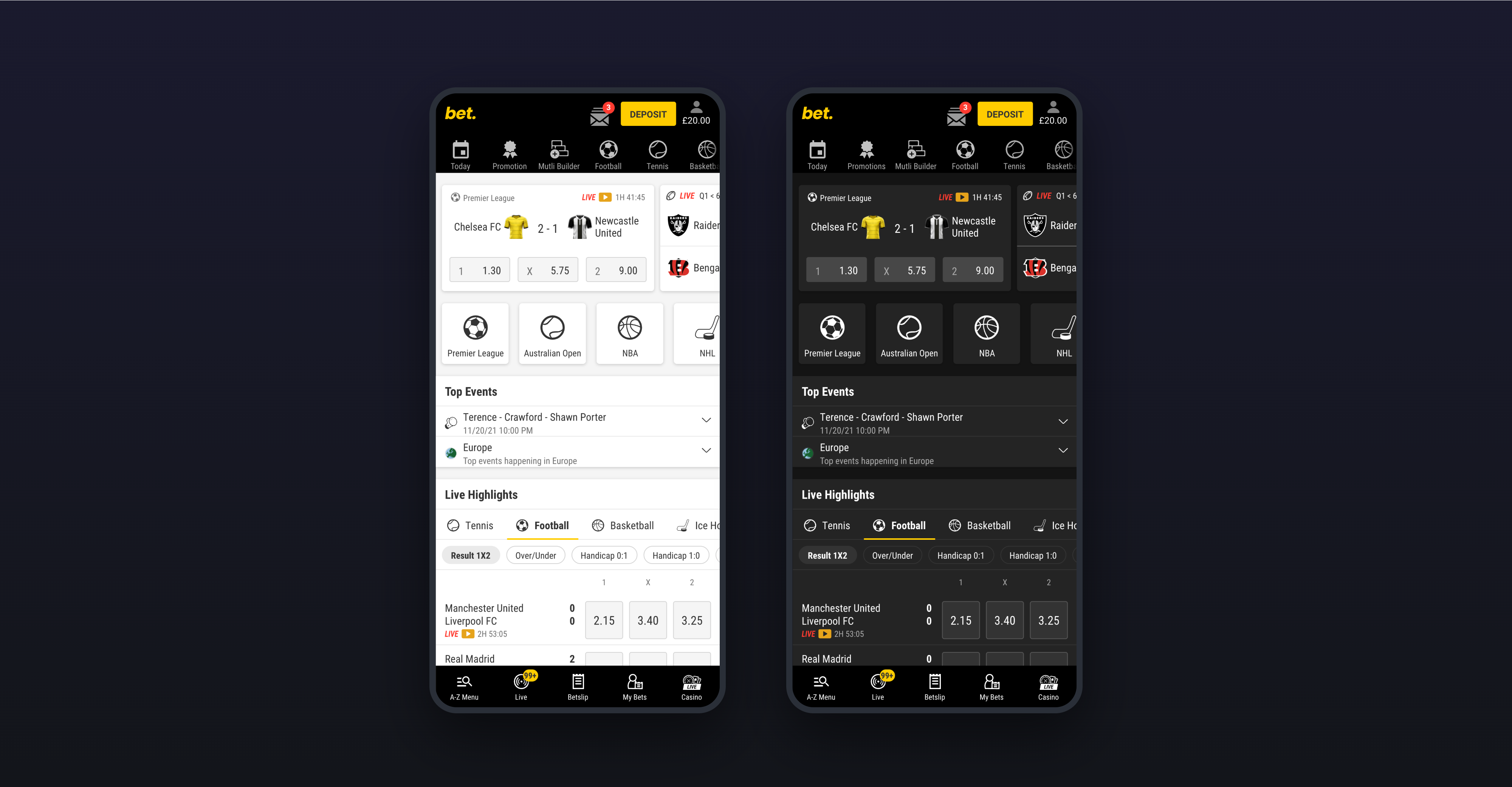
Theming at the semantic token level — not a paint job. Structure and interaction patterns locked; colours, typography, and iconography owned by each brand. Brands feel distinct while sharing the vast majority of the codebase.
Layout, spacing, responsive behaviour. Identical across every brand.
Colours, typography, iconography via semantic tokens. Components consume tokens, never raw colour.
Promotional graphics and editorial content that varies per brand and per market.
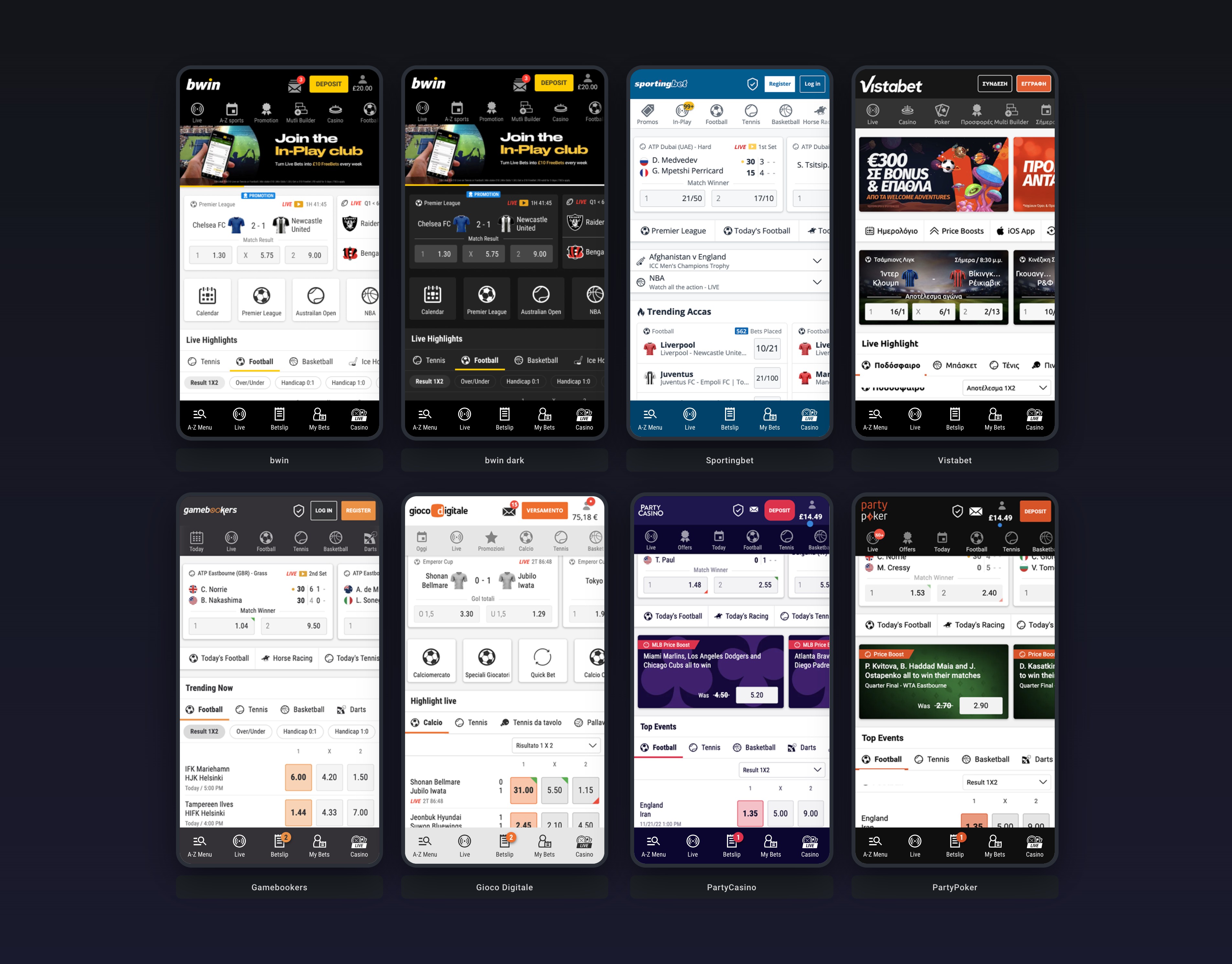
bwin's flagship dark theme and Coral's light theme both built from the same semantic token set. Switch a theme, the entire product adapts — no component-level overrides needed.